We look at the present through a rear-view mirror.It is difficult, as Marshall McLuhan observed, to understand the times we are living in. And perhaps it is only now that we have some chance of really understanding, in retrospect, the phenomenon that became known as ‘Postmodernism.’
We march backwards into the future.
(McLuhan and Fiore 1996: 75)
The exhibition Postmodernism: style and subversion. 1970-1990
(Victoria and Albert Museum, to 15 January 2012), attempts to lend some coherence to the subject of postmodernism, by presenting a broad survey of design and art from these two decades (and a little before). In this it is broadly successful, and the curators, Glenn Adamson and Jane Pavitt, deserve credit, I believe for a largely coherent treatment of postmodernism through selection and exhibition of a wide range of works from architecture, art and design.
The exhibition does of course have some of the disadvantages of a survey, a widely cast net and consequent lack of depth in any one discipline, along with a sense of works being highly filtered and selected, which a focus on a more narrow field could have avoided. But it also has the merits of a survey – a broad and inclusive treatment, and a certain didactic clarity. And there is still a focus, appropriate to the V&A, which is, of course, design.
There are, as the curators explain in the catalogue essay, exceptions – notably for me, the literary, since one might argue that postmodernism sprang at least as much from literature as from architecture.
There is also an odd paradox, the careful arrangement of the exhibition, more or less, into disciplines – e.g. architecture, graphic design, furniture (though with thematic connections that also cross the disciplines). And a greater paradox of the seeming use of chronology – a paradox because the synchronic, and a notion of the ‘end of history’ (Fukuyama) was a feature of the postmodern. History is back now. And probably modernism too – architecture has long spoken of the ‘neo-modern’ and Bourriaud has coined the term ‘Alter-modern’ for our present times. Perhaps the modern never really went away – except that today’s modernism can not be like that of the 1960s...

Ettore Sottsass (1969). Teapot
Ettore Sottsass’s (1972) Basilico Teapot Prototype, in painted wood, encountered in the first room of the exhibition, seemed to set the tone well (the above image is an earlier version). A playful application of architectural form to a domestic object – light hearted and yet, oddly alien. Ironic, and quoting history with little sense of any weight of that history – a basilica turned teapot.

Venturi R (1964) Vanna Venturi House
Robert Venturi’s (1959-1964) Model of Vanna Venturi House also gave insight into the origins of the postmodern. Not far off the modern at all, and yet, it had subverted the archetypal house by absurd shifts of scale and distortions of conventional form. And a slightly surprising arc, decorating the facade, interrupted the otherwise linear forms – the arc itself broken by a jarring interruption of the facade that penetrated the interior space. (Venturi’s book Learning from Las Vagas is very illuminating about postmodern architecture).

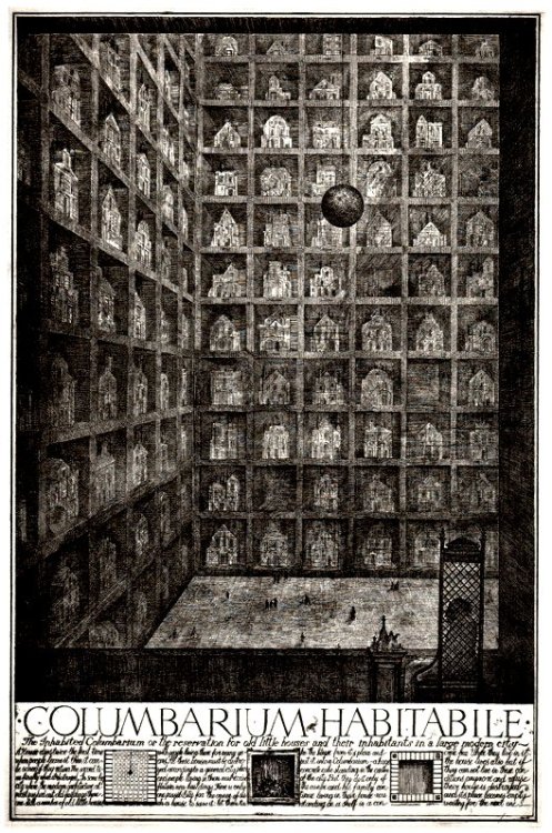
Brodsky and Utkin (1989) Columbarium Habitabile. Etching http://25.media.tumblr.com/tumblr_ksqvya72to1qzz5i6o1_500.jpg
Other pieces that caught my eye included Paolini’s Arte Povera work L’altra figura (1984) and the fantasy architecture of Alexander Brodsky and Ilya Utkin with their Soviet era etching Columbarium habitabile (1989) – a ‘reservation for old houses and their inhabitants in a large modern city.’
Aside from seeing new works (and the show had an exciting global scope) I was struck by a number of themes. Firstly the impact of architecture – that often escaped architecture itself – (Pieter de Bruyne’s (1975) Chantilly Chest, and other furniture and domestic objects had strongly architectural feel). A second theme that came over well was bricolage – the idea of working with ‘oddments left over from human endeavours’ (Levi Strauss - exhibition notes). And, thirdly, a comment by my colleague Mary Kuper, who noted that postmodernism seemed to be marked by an almost complete separation of form and function (in contrast of course to the marriage of form and function in the modern). This is somehow where the question of style comes in. Bricolage – a cobbling together of diverse elements – became an often jarring aesthetic choice in itself. But the separation of form and function, and the eclectic quoting from the past, without worrying too deeply about historic significance, lent itself to a playful approach to style, and the playing on style, seemingly for its own sake, that at times amounted to enthusiastic and guilt-free stylisation. Style is a complex question, and one to which we will return in future...
Postmodernism is a rewarding and often surprising exhibition.
Bibliography
McLuhan M. & Fiore Q.(1996) The medium is the massage. London: Penguin
Venturi R. (1977). Learning from Las Vegas. Cambridge MA: MIT Press
Bibliography
McLuhan M. & Fiore Q.(1996) The medium is the massage. London: Penguin
Venturi R. (1977). Learning from Las Vegas. Cambridge MA: MIT Press


