
"Africa as setting and backdrop which eliminates the African as human factor. Africa as a metaphysical battlefield devoid of all recognizable humanity, into which the wandering European enters at his peril. Can nobody see the preposterous and perverse arrogance in thus reducing Africa to the role of props for the break-up of one petty European mind? But that is not even the point. The real question is the dehumanization of Africa and Africans which this age-long attitude has fostered and continues to foster in the world. And the question is whether a novel which celebrates this dehumanization, which depersonalizes a portion of the human race, can be called a great work of art. My answer is: No, it cannot".
18/11/2013
Casting Kurtz
Note: essential that you, individually, move through and beyond these direct and indirect 'castings' of Mr. Kurtz – particularly Kinski and Brando. The idea here is to make plain a method one might apply, in order to see and hear him.
.jpeg)


.jpeg)
Leonardo da Vinci: Study of the effect of light on a profile head (c. 1487–1490).
Charles Manson. "From the beginning of his notoriety, a pop culture arose around him in which he ultimately became an emblem of insanity, violence and the macabre" (via).

Pablo Picasso: Self portrait (1972).
Footage of Klaus Kinski, during filming of Werner Herzog's "Nosferatu the Vampyre" (1979), a melancholic, lyrical homage to the magnificent "Nosferatu, eine Symphonie des Grauens" (1922), directed by F.W.Murnau.
In both versions, a kind of infamy has grown around the relationship between director and lead actor – where the actor and the part also merge. In the case of Murnau's original, Max Shreck is so synonymous with his portrayal of the verminous Count Orlock, that the recent film "Shadow of the Vampire" (2000) suggests — with unsettling humour — that the actor was (indeed) Undead.
Herzog and Kinski's volatile collaboration led to five seminal films, all of which cast Kinski somehow within a Kurtz-like hegemony. Herzog's documentary "My Best Fiend" (1999) is the definitive account.

Portrait bust of a man, 1st century B.C.; Republican Roman – from the Metropolitan Museum of Art, New York. "Prestige came as a result of age, experience, and competition among equals within the established political system. These are the values expressed in portraits of grim-faced, middle-aged men, such as the one featured here."

Marlon Brando as Colonel Kurtz, in Francis Ford Copolla's "Apocalypse Now" (1979). Here, reading from T.S. Eliot's "The Hollow Men" (1925). The poem begins with an epigram, quoting "Heart of Darkness". Later, it references Dante Alighieri's "Inferno" from "The Divine Comedy" (c. 1308–1321), as does Conrad throughout the novella.
"The Hollow Men" resonates with "Heart of Darkness" throughout. For example:
This is the dead land
This is cactus land
Here the stone images
Are raised, here they receive
The supplication of a dead man's hand
Under the twinkle of a fading star.
Is it like this
In death's other kingdom
Waking alone
At the hour when we are
Trembling with tenderness
Lips that would kiss
Form prayers to broken stone.
06/05/2013
Non-Euclidean Type
I just watched that BBC 2 documentary on Non-Euclidean geometry posted earlier, it's great. I could feel my mind start bending a little when they started trying to depict the hypercube.

It reminded me of these sketches by David Bennewith for a 3-dimensional typeface, and gets me thinking on where we could begin with depicting a 4-dimensional typeface, with all that fluidity.

03/05/2013
Clapping music
In this piece, Reich uses the most fundamental of human attributions, beside the voice, to "create a piece of music that needed no instruments beyond the human body". This piece of work, while developed from an intrinsic knowledge of music, is also based on rules, and therefore, patterns. I was struck when revisiting this piece recently, that one could liken this piece to wave interference patterns; those moments where the patterns of the rhythm fall in and out of sequence with each other constructive and destructively, adding to the rhythm, creating moments of quiet.
"...one performer claps a basic rhythm, a variation of the fundamental African bell pattern in 12/8 time, for the entirety of the piece. The other claps the same pattern, but after every 8 or 12 bars s/he shifts by one eighth note to the right. The two performers continue this until the second performer has shifted 12 eighth notes and is hence playing the pattern in unison with the first performer again (as at the beginning), some 144 bars later."
See also: A juggling interpretation and György Ligeti's Poème Symphonique For 100 Metronomes.
– Rosie
The famous couple

“It was very hard finding this photograph. We needed to navigate the thin channel between full bodily disclosure and NASA’s fear of the adverse publicity generated by sending pictures of naked people into space. Apparently we failed, because this was the only picture in our final image sequence that NASA would not allow on the Record.
I had the idea of drawing silhouettes to accompany selected Voyager photographs in an attempt to help the ETs understand how we see pictures, and the importance of edge-detection in our vision. By maximizing the figure/ground relationship of the important subjects, I hoped the photographs would be easier to understand.
This photograph of a nude human couple was taken by George Hester, a widely respected photographer of nudes. His photograph did not fly but the silhouette did. How mysterious it may seem to ET looking for the photograph that should accompany this silhouette. How will they explain the absence? Is the concept of body taboo even possible for ET to infer?
NASA was less concerned about offending ET’s sensibilities than the reaction of the contemporary audience. They decided that the American public was not ready for full frontal nudity on spacecraft. They worried the public would react negatively and the result would be an unfavorable reaction that would damage NASA.
In almost thirty years of telling this story to audiences of every demographic makeup, I have yet to find a single person who admits to agreeing with NASA’s decision. In fact it has been considered the worst error made in the creation of the Voyager Record.”
– An account by Jon Lomberg

Pioneer plaques
 |
Designed by Carl Sagan & Frank Drake; artwork by Linda Salzman Sagan.
|
“The Pioneer plaques (9x6 inches) are a pair of anodized aluminum plaques which were placed on board the 1972 Pioneer 10 and 1973 Pioneer 11 spacecraft, featuring a pictorial message, in case either Pioneer 10 or 11 is intercepted by extraterrestrial life. The plaques show the nude figures of a human male and female along with several symbols that are designed to provide information about the origin of the spacecraft.
...The Pioneer spacecraft were the first human-built objects to leave the Solar System.”

The plaque contains within its pictorial symbolism a complex message which assumes a language or method of reading that on the one hand details a scientific methodology for deducing the spacecraft’s origin, and on the other attempts to convey something elementary about the life-form that is the cause of its existence. It is at once minutely specific and also metaphorical; on the left hand side, it details a radial pattern which stand for “periods of pulsars, using the hydrogen spin-flip transition frequency as the unit” and on the right, the naked white Occidental man raises his hand in good will. We have paired ourselves down to our most simplified and elementary components as a way of revealing something essential about humankind, but what are we really conveying about ourselves?
See also: Edward Tufte's redesign of the plaque, the voyager golden record and the Arecibo message.
– Rosie
02/05/2013
Resources from Lecture 3: Electricity
Educational films explaining the physical principles behind sound waves, their generation and manipulation:
The Nature of Sound (1948)
Sound Waves and Their Sources (1933)
An overview of concepts in electricity, covering topics such as electric charge, current and conductivity, electric and magnetic force:
Principles of electricity (1945)
An educational film showing the creation of magnetic fields through electrical current:
Electromagnets (1966)
An educational film covering phenomena such as reflection and refraction of light, focussing and the principles of cameras:
The Nature of Light (1948)
A historical overview of color and the associated physical principles of light. The film is split in six parts:
Light and Color
A public lecture by Richard Feynman explaining the wave-particle duality and its role in quantum mechanics:
Richard Feynman: Probability and Uncertainty – The Quantum Mechanical View of Nature (1964)
01/05/2013
Using light to talk about light
 |
| Bill Culbert - An Explanation of Light (1984) |
Ask yourself: what does this piece explain (if anything) about the physical nature of light? Furthermore, what can art do to the function and meaning of an object?
Art behaves and explores topics very differently than science. Artists can be as ambiguous as they like (if they like), they invite open interpretation in an individual’s theoretical framework, as well as without a framework. Art is free to be totally ambiguous and misleading, it can mean whatever the viewer thinks or wants it to mean as well as what the artist intended it to mean at the same time. Is falsifiability impossible in establishing meaning in art? Is there a spectrum of this impossibility (if any at all) if we include illustration and information design?
As for science, although experiments, theoretical reasoning and discourse can yield very ambiguous and strange results, the way scientists invite interpretation is concerned with inviting contestation and matching an interpretation against a distinct, descriptive, theoretical framework based on mathematics, logic, empiricism and falsibiablility.
Where and how can art and science overlap? How (if at all) do they both attempt to repudiate the notion of universal facts and truths? Both art and science are concerned with critical enquiry i.e. re-think this light bulb as a functional object , re-think its properties or re-think the physical nature of light. How do both art and science contest epistemological justification, representationalism, and the notion of epistemic objectivity?
– Jennifer
The face on mars
 |
| The original image taken by the Viking 1 orbiter in 1976. |
Humans have always projected their own hopes and fears onto interstaller objects like this famous cultural anthropomorphism. As a social species we are particularly hard-wired to recognise faces. Perhaps this is the reason why Jesus pops up on a piece of toast, or a giant face emerges out from the shadows of arbitrarily arranged Mars rocks.
 |
ESA/DLR/FU Berlin (G. Neukum), MOC (Malin Space Science Systems)(2006)
|
NASA used the likeness to their advantage, as a way to garner interest in Mars. They even suggested themselves in the 1976 press release: "The picture shows eroded mesa-like landforms. The huge rock formation in the center, which resembles a human head, is formed by shadows giving the illusion of eyes, nose and mouth." When NASA returned to Mars in 1997, they felt they owed it to the taxpayer and reshot this famous image. With better quality equipment, the mystery disappears. No human head, no alien monument. Just a natural landform.
Read more about unmasking the face on Mars.
– Natalie
30/04/2013
Making sand swim
 |
| Klaus Weber Sand Fountain (2012) |
Klaus Weber's piece Sand Fountain is both transformative and oppositional – encouraging a reconsideration (among other things) of what a fluid is, even if water is wet and sand is dry – if one can be substituted by the other then what exactly is the difference?
The falsification criteria that Malte spoke about is also concerned with being oppositional, exploring where our theories and ideas about the world break down and where they hold their own.
– Jennifer
29/04/2013
Sun, Planet, Moon

The PhET project at the University of Colorado have a huge range of interactive simulations which help to visualise some difficult concepts. Above is a screen shot of 'My Solar System' describing orbits and gravitational pull of massive bodies; of the Moon around the Earth and the Earth and Moon around the Sun.
Science fiction: Asking questions to the future
Latest since the industrial revolution, the cultural significance of science has become impossible to miss. It has transformed our lives beyond recognition and is continuing to do so at an ever increasing speed. The technologies we create change the way we interact with the world. Through the internet we have created means of communication that are dissolving our traditional notions of time and information. Before we have even come close to understanding its significance for the coming generation, this piece of technology itself has already transformed again and is now delocalised and touchable on a smart phone. How will this development change our view of the world? Will we be able to keep up with our own progress? Through science and technology, we have not only achieved a greater understanding of the world around us, we have also become able to shape it. But what happens when we do it?
Science fiction often attempts to trace out the answers without us even asking. Which way will tomorrow’s technology pave for us? What role will it play in the future of our society? As complex and speculative as these questions are, we cannot hide from them. In many science fiction stories this becomes most strikingly obvious when artificial intelligence enters the stage. We may be able to avoid asking ourselves the question what we want to do with our technology. But should we ever build an intelligent machine, it will do it for us. From ‘Odyssey 2001’ to ‘Blade Runner’ and Isaac Asimov’s short stories, once the future itself asks us how we got there, we better come up with a good answer.
– Malte
Signs of the Fourth Dimension
In this lecture author and professor at the University of Texas, Dr. Linda Dalrymple Henderson, discusses the subject of her book 'The Fourth Dimension and Non-Euclidian Geometry', pictured below. In it, she traces a parallel development between developments in geometry and modern art.

Non-euclidian geometry required a shift in how we perceive and understand the space we live in, from assumptions based on immediate perception and human experience to concepts which are no longer derived from human experience and intuition. You can draw two parallel lines on a piece of paper and they will never meet, but draw those two lines across the surface of the spherical Earth and they will curve and meet. Henderson argues that this development, with the possibility of a spatial fourth dimension "encouraged radical innovation by a variety of early twentieth-century artists, ranging from French Cubists, Italian Futurists, and Marcel Duchamp, to Max Weber, Kazimir Malevich, and the artists of De Stijl and Surrealism."
More on Non-Euclidean Geometry:
26/04/2013
Whipple, Wave Machine

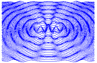
A late C19th model to demonstrate how waves move; made by the Elliott Brothers, to a design by Baden Powell ((1796-1860) – the father of Robert, founder of the scout movement). An interactive animation here.

This — and other explanatory scientific models — can be seen at the seemingly wonderful University of Cambridge Whipple Collection. Here — with a linking thought on the 'sculpting' or 'choreography' of sound waves — an unattributed pair of parabolic sound mirrors, again late C19th.

The principles apply through a history of use, from these almost Neolithic, pre-radar wartime sound mirrors (via Web Urbanist) to today's satellite dishes.

Some lovely examples collected by Web Urbanist, for example this Czech 'acoustic detector', c. 1920.
20/04/2013
Dimensional Space
In this small panel from the Maesta, Christ and his disciples approach the gate to Jerusalem greeted by a crowd. Some naturalistic depiction of objects and space is employed, though not linear perspective. In the Mediaeval manner Christs's disciples are huddled together because they are a group, similarly the crowd at the gate.
Essentially, Duccio's painting reflects an Aristotelian view of space, in which individual objects contain space, but no universal interconnecting (or abstract) dimensional space exists into which objects may be placed.
For more of my thoughts on dimensional space, see http://criticism-and-interpretation.wikispaces.com/Space+-+dimensional
 |
| Duccio di Buoninsegna, (c1308-11) Christ's entry into Jerusalem, panel from the Maesta, Museo dell'Opera Metropolitana del Duomo, Siena |
Essentially, Duccio's painting reflects an Aristotelian view of space, in which individual objects contain space, but no universal interconnecting (or abstract) dimensional space exists into which objects may be placed.
For more of my thoughts on dimensional space, see http://criticism-and-interpretation.wikispaces.com/Space+-+dimensional
Subscribe to:
Posts (Atom)