30/11/2011

Postmodernism

Postmodernism: style and subversion. 1970-1990
We look at the present through a rear-view mirror.
We march backwards into the future.
(McLuhan and Fiore 1996: 75)
It is difficult, as Marshall McLuhan observed, to understand the times we are living in. And perhaps it is only now that we have some chance of really understanding, in retrospect, the phenomenon that became known as ‘Postmodernism.’

The exhibition Postmodernism: style and subversion. 1970-1990
(Victoria and Albert Museum, to 15 January 2012), attempts to lend some coherence to the subject of postmodernism, by presenting a broad survey of design and art from these two decades (and a little before). In this it is broadly successful, and the curators, Glenn Adamson and Jane Pavitt, deserve credit, I believe for a largely coherent treatment of postmodernism through selection and exhibition of a wide range of works from architecture, art and design.

The exhibition does of course have some of the disadvantages of a survey, a widely cast net and consequent lack of depth in any one discipline, along with a sense of works being highly filtered and selected, which a focus on a more narrow field could have avoided. But it also has the merits of a survey – a broad and inclusive treatment, and a certain didactic clarity. And there is still a focus, appropriate to the V&A, which is, of course, design.

There are, as the curators explain in the catalogue essay, exceptions – notably for me, the literary, since one might argue that postmodernism sprang at least as much from literature as from architecture.

There is also an odd paradox, the careful arrangement of the exhibition, more or less, into disciplines – e.g. architecture, graphic design, furniture (though with thematic connections that also cross the disciplines). And a greater paradox of the seeming use of chronology – a paradox because the synchronic, and a notion of the ‘end of history’ (Fukuyama) was a feature of the postmodern. History is back now. And probably modernism too – architecture has long spoken of the ‘neo-modern’ and Bourriaud has coined the term ‘Alter-modern’ for our present times. Perhaps the modern never really went away – except that today’s modernism can not be like that of the 1960s...


Ettore Sottsass (1969). Teapot


Ettore Sottsass’s (1972) Basilico Teapot Prototype, in painted wood, encountered in the first room of the exhibition, seemed to set the tone well (the above image is an earlier version). A playful application of architectural form to a domestic object – light hearted and yet, oddly alien. Ironic, and quoting history with little sense of any weight of that history – a basilica turned teapot.


Venturi R (1964) Vanna Venturi House


Robert Venturi’s (1959-1964) Model of Vanna Venturi House also gave insight into the origins of the postmodern. Not far off the modern at all, and yet, it had subverted the archetypal house by absurd shifts of scale and distortions of conventional form. And a slightly surprising arc, decorating the facade, interrupted the otherwise linear forms – the arc itself broken by a jarring interruption of the facade that penetrated the interior space. (Venturi’s book Learning from Las Vagas is very illuminating about postmodern architecture).
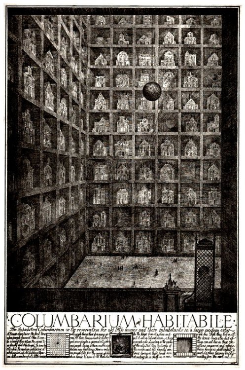


Brodsky and Utkin (1989) Columbarium Habitabile. Etching http://25.media.tumblr.com/tumblr_ksqvya72to1qzz5i6o1_500.jpg

Other pieces that caught my eye included Paolini’s Arte Povera work L’altra figura (1984) and the fantasy architecture of Alexander Brodsky and Ilya Utkin with their Soviet era etching Columbarium habitabile (1989) – a ‘reservation for old houses and their inhabitants in a large modern city.’

Aside from seeing new works (and the show had an exciting global scope) I was struck by a number of themes. Firstly the impact of architecture – that often escaped architecture itself – (Pieter de Bruyne’s (1975) Chantilly Chest, and other furniture and domestic objects had strongly architectural feel). A second theme that came over well was bricolage – the idea of working with ‘oddments left over from human endeavours’ (Levi Strauss - exhibition notes). And, thirdly, a comment by my colleague Mary Kuper, who noted that postmodernism seemed to be marked by an almost complete separation of form and function (in contrast of course to the marriage of form and function in the modern). This is somehow where the question of style comes in. Bricolage – a cobbling together of diverse elements – became an often jarring aesthetic choice in itself. But the separation of form and function, and the eclectic quoting from the past, without worrying too deeply about historic significance, lent itself to a playful approach to style, and the playing on style, seemingly for its own sake, that at times amounted to enthusiastic and guilt-free stylisation. Style is a complex question, and one to which we will return in future...

Postmodernism is a rewarding and often surprising exhibition.

Bibliography
McLuhan M. & Fiore Q.(1996) The medium is the massage. London: Penguin
Venturi R. (1977). Learning from Las Vegas. Cambridge MA: MIT Press

14/11/2011

Postmortemism


A few weeks now since visiting Postmodernism: Style and Subversion 1970–1990 at V&A. It did feel timely. A tough one to curate but something happened enough to make it resonate for weeks after. At the age and stage now to be presented with a lived-through history, which makes one much more aware of the edit and framework. In terms of the greedy eye — the elements which impact and feed concurrent working concerns — a film of Kazuo Ono, performing La Argentina, stopped my heart for a moment. Horrifying and beautiful in micrometrically equal measure (the c.1600s pre-perjorative meaning of the word 'grotesque' was fanciful, or fantastic). Rare to see an original form that shocks. This, attributed to Ono, sums it:

"There are an infinity of ways in which you can move from that spot over there to here. But have you figured out those movements in your head, or are we seeing your soul in motion? Even that fleck at the tip of your nail embodies your soul... the essential thing is that your movements, even when you're standing still, embody your soul at all times."


This 'embodiment' does remind me of the acute, needle-sensibility of Matthias Grünewald's The Crucifixion (1515) (via).


And the artificial limbs at the
Wellcome Collection's permanentMedicine Man displays.


Tatsumi Hijikata, it seems, was the founder of the dance-form Butoh; but somehow in parallel, they took the form forward, albeit with divided concerns. Hijikata's work was more violently trangressive in its themes and spectacle, borne of a post-war, 1968-catalysed rejection of an undue, superficial imitation of Noh and of the West; towards a subversive, truly Japanese form.


The first corner turned in the show featured two long-held-heroes; Ettore Sottsass and Tadanori Yokoo. This poster (
via), from 1965. Learning from Las Vegas — as a documentation of the strip, rather than the later book — began in 1968. A group of the earliest works in the show are from this year too. Interesting to think of the student/worker protests as a cultural catalyst for Po-Mo.


Das Scweizer Plakat (1984) by Wolfgang Weingart, via MoMA.


And Kunsthalle Basel Kunstkredit (1976-77), also by Weingart; alsovia. A nice conversation was had, in front of Yokoo's and Weingart's posters. The Weingart characteristic is so much a product of its technical time; the make and then break with the Swiss typography amplified by the dot-screen photosetting of layers. Intrinsically planographic. But also the fragmentation is making evident the gridded alignments it breaks, so it's a respectful eruption.


Adhocist Chair (1968) by Nathan Silver, via. The perfect incarnation of Charles Jencks' "using an available system". Furniture, architecture and ceramics to discuss from this show; perhaps in another post.

30/10/2011

Adrien Gary Lucca, colour mixing and separation


Regarding the upcoming project, on reprographic process. "Adrien Gary Lucca is currently researcher at the Jan van Eyck Academie, Maastricht, The Netherlands. He creates large-scale paint drawings which confront mathematics, geometry, forms and colours. For the colour studies, he has developed a personal colour mixing methodology inspired by the 19th-century research of Georges Seurat. The second series of works may seem like grey charts, or scales of brightness. Black paint lines are carefully quantified inside bi-dimensional forms (circles or squares); the contrast between the white colour of the paper and the black paint varies from a minimum to a maximum point. These studies are models for future large-format wall drawings that will interact with the lighting like custom in-situ filters." Quoted from — and via — We Find Wildness.

18/09/2011

Where Blake saw angels - replanting the Angel Oak on Peckham Rye


Adriana, reciting poetry on Peckham Rye (photo: (c) Scott Johnson 2011)


Thanks to Scott Johnson, for this post recounting today's Blake Society event:


In 1765 an eight-year-old William Blake saw his first vision; 'A tree filled with angels, bright angelic wings bespangling every bough like stars.' He saw this on Peckham Rye.


Today I went to the Rye to join the Blake Society and artist John Hartley in the planting of a young oak tree somewhere near that spot where William Blake first saw his angels.The event began at noon with a lady called Adriana who - in eighteenth century costume - recited poetry; mostly about angels; at a string of locations around Peckham Rye Park.


This was followed by a performance and video screening by Matt Sexton. We gathered round an oak tree in the park; and a video played from his laptop which lay on the floor, covered in oak leaves. At the same time, he walked through the crowd with a hand-held projector, projecting the film onto people's bodies.Matt explained afterwards that the video contained interviews of some of the 62 South African school children who in 1995 all witnessed a UFO. He said that the children's vision of the UFO was partly a product of our time as Blake's vision of angels was partly a product of his.


Planting of the Angel Oak (photo (c) Scott Johnson, 2011)


From here we moved to a space on the Rye that is believed to have been close to where William Blake had his vision.Artist John Hartley explained that, as a child, Blake lived in the West End; an area which at the time was the margins of London; and that Peckham today is in some ways an area of margins. He said that artists are attracted to margins and so was William Blake. John then explained that the new sapling had been brought to the Rye from the margins of England. He and a friend had driven to the coast, to an eroding cliff and taken a young oak that was ready to fall into the sea, and brought it there to Peckham Rye. As the tree was lowered into it's new hole, everybody was encouraged to help by chucking a handful of dirt in.


The new Angel Oak can be seen at the Dulwich end of Peckham Rye.


Links:
Audio bite of the event
http://soundcloud.com/herebeangels/episode5
John Hartley's web site http://www.ambivalency.net/angel%20oak.htm
The Blake Society
http://www.blakesociety.org/2011/08/23/september-event/


30/08/2011

Fiction: Place, Diorama


Jens Reinert. More here. Notes to come.


Jockum Nordström. More here. Notes to come.

06/07/2011

Wilder Shores of Love


Cy Twombly has died, age 83. For such an idiosyncratic, he is held as a standard by many I've known or taught, in their reaching for a way to make. He showed a way to make work from narrative without being literal. He showed that the history of a drawing is the drawing. He showed that no work is definitive. Latterly, at the Tate's retrospective, the revelatory sculptures. Today, finding some of his photographs; stand-alone in a way similar to Tarkovsky's polaroids. This, 'Yard Sale' (1993), via. Nearby, Dulwich Picture Gallery have just opened 'Arcadian Painters: Twombly and Poussin', with the 16mm Tacita Dean film Edwin Parker. Rest in peace.

21/06/2011

Illustration Students' Documentary at Kyoto Seika University


A group of six Second Year Camberwell Illustration students are now spending one month at Kyoto Seika University, accompanied by alumnus Chie Miyaki and current First Year Daniel Draper as translators. The team are making a documentary, with a focus on the University's distinguished Manga teaching programme. We are all following their progress (and enjoying their holiday snaps) here.

10/06/2011

Forest marks, Love is Enough, Utopia


A month or so ago, my Camberwell group visited the London Metropolitan Archive, the Guildhall Art Gallery and library, brokered by Adrian Holme. A day leafing through and opening up fascinating documents of — and belonging to — the City of London.


The LMA is, simply put, London's archive. Kilometres of shelving in strong rooms, holding miscellany reaching back to a small piece paper, a 1067 decree by William the Conqueror (or the Bastard as he was known at the time).


We spent some time with boxes brought up from the archive, related to Adrian's seminars this year. What became clear, is the impossibility of a definitive record. Through the conservator's studio and here, we handled Victorian concertina'd paper viewfinders of the Crystal Palace, a scrapbook belonging to an employee of Horniman's Tea, photographs of crowds esconced in banter and singalong, in Bethnal Green tube station during an air raid, hand-coloured architectural plans and sections of a works. It's clear there were reams of more linear records but the unpredictable truth-telling of these things detained us.


I enjoyed the Epping Forest box.


The Guildhall library presented an opportunity to handle two amazing, original Kelmscott Press editions in a limp vellum binding. This, Morris' Love is Enough (1897) with illustrations by Edward Burne-Jones. A full 100-page scan here.


And Thomas More's Utopia (1893). Note the yapp edges. Also seen here.

25/05/2011

Steve Bell at the Cartoon Museum


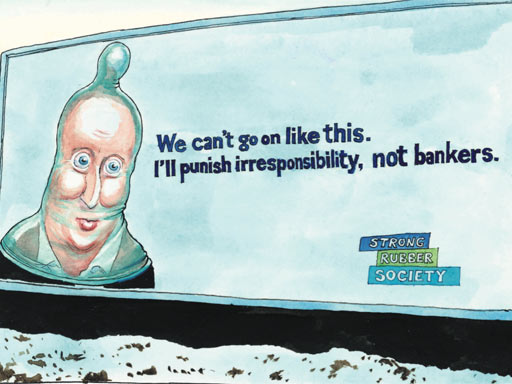
Source: http://static.guim.co.uk/sys-images/Guardian/Pix/pictures/2010/1/12/1263261460869/steve1.jpg


Political cartoonist Steve Bell has an exhibition at the Cartoon Museum, until July 24th. Bell also charts his career and discusses his approach to caricature in a Guardian story that accompanies the current exhibition.


Bell Epoque: 30 Years of Steve Bell is at the Cartoon Museum, 35 Little Russell Street, London WC1, until 24 July. Students £3 with ID.